

The New Broncos logo meaning sits at the centre of Brisbane’s biggest identity adjustment since the early 2000s — a shift arriving just a season after the club completed a headline-grabbing premiership double across the NRL and NRLW. The reveal followed months of speculation triggered by a trademark leak, pushing the club into the spotlight earlier than expected.
As Brisbane prepares for the 2032 Olympics and a crowded southeast Queensland sporting market, the 2026 brand refresh aims to balance tradition with a sharper, globally aware presentation.
How the Branding Shift Began & New Broncos Logo Meaning — Key Comparison Table
The process began unintentionally when an IP Australia filing surfaced online, revealing a front-facing horse and shield design before any official announcement. The early leak created social buzz and forced the Broncos to manage narrative and timing, even as their long-running project continued behind the scenes.
The club partnered with DDB Group — a global agency known for transforming high-profile sporting identities — and consulted across internal and external stakeholder groups, including sponsors, staff, players and select fan members.
Several influences shaped the final look: digital usability, global marketability, and alignment with Brisbane’s long-term city branding plans.
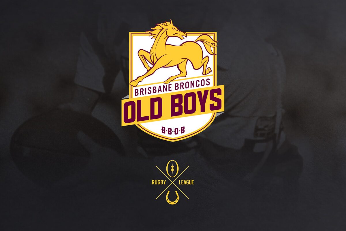
New Broncos Logo Meaning — Key Comparison Table
| Feature | Old Identity | New 2026 Identity |
|---|---|---|
| Horse direction | Side-profile, static | Forward-facing, aggressive momentum |
| Wordmark | “Broncos” dominant | “Brisbane” prioritised for city-first identity |
| Design styling | Detailed, traditional curves | Minimalist, scalable for modern broadcast & retail |
| Symbolic line | None | Single river line representing Brisbane River |
| Overall tone | Heritage-heavy | Global, clean, future-focused |
These changes reflect how many global clubs — from Juventus to Inter Miami — have simplified their marks for improved versatility, particularly across digital platforms.
New Broncos Logo Meaning in Motion, Updated Jerseys & The Mantra Behind the Shift
The New Broncos logo meaning becomes clearer when applied to jerseys, digital layouts and on-field branding. The front-facing horse has been designed for sharper visibility on TV, in motion graphics and on merchandise — a common goal for modern NRL and AFL clubs.
Why “Broncos” Was Removed
The club leaned heavily into three strategic goals:
- A city-first identity that positions Brisbane as the flagship Queensland club
- Cleaner, global-ready visuals for international markets
- Brand alignment with major Brisbane events, including the 2032 Olympics
Some supporters praised the boldness; others questioned whether the traditional side-profile horse was more iconic. Social examples show the divide clearly — one fan labelled it “a natural evolution,” while another described it as “NRL’s version of Juventus 2017.”
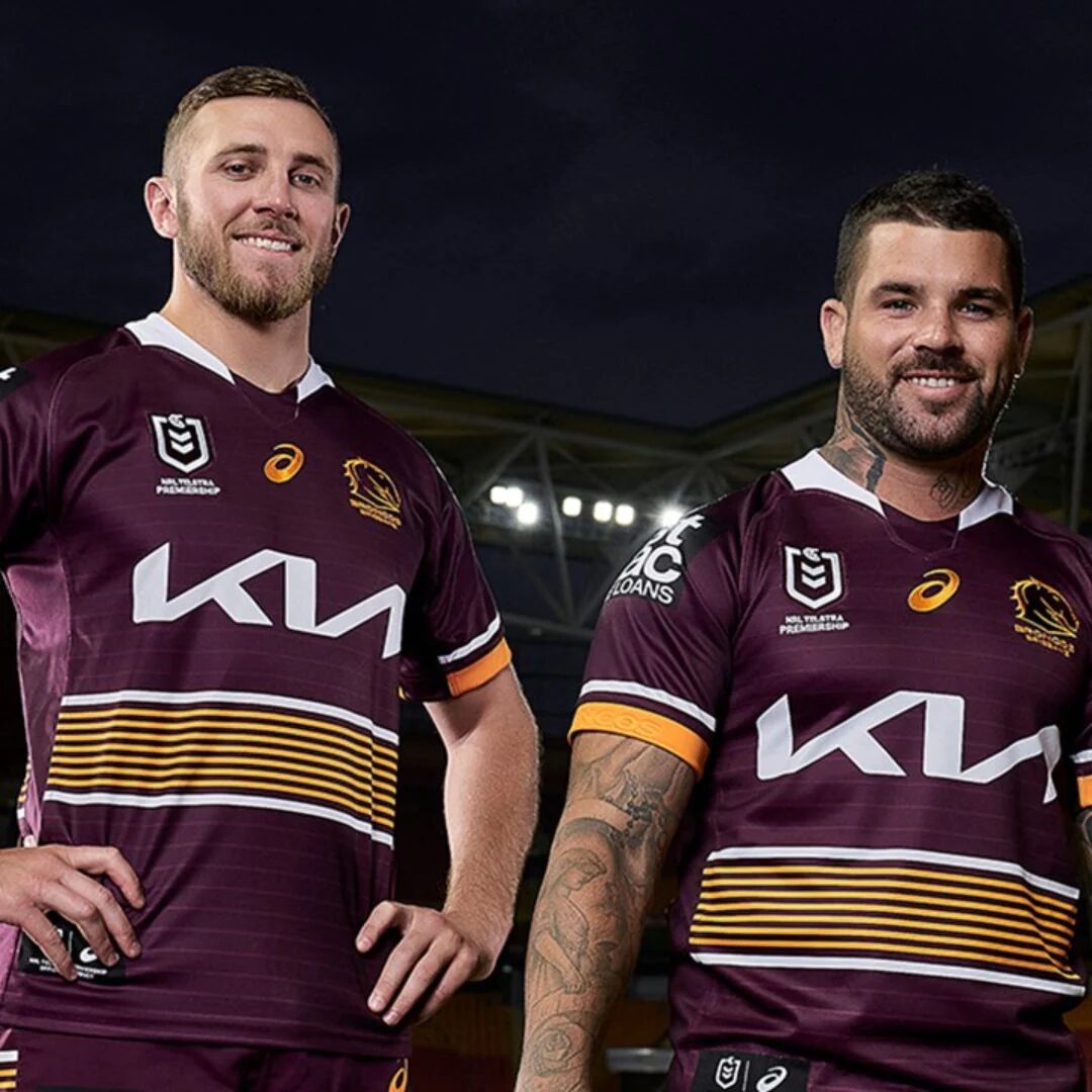
2026 Jerseys at a Glance
- Home kit: refined maroon-gold balance, simplified striping, sharper edges around the shield
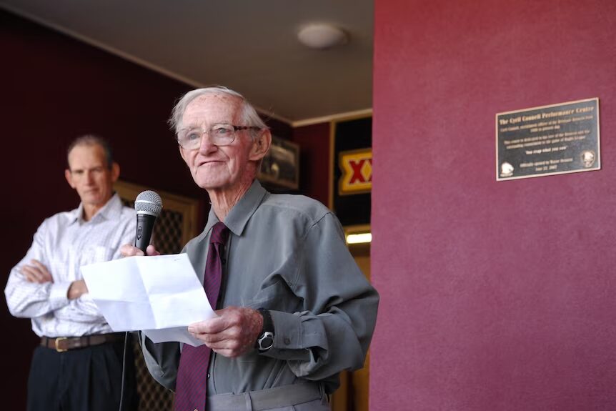
- Away kit: navy/midnight Cyril Connell tribute — a nod to Queensland’s most influential recruiter
- Heritage elements: subtle stitching patterns referencing classic state-era colourways
The jerseys mirror the broader shift: modern presentation layered with specific anchors to club history.
Fan, Player & Media Reaction Across the NRL Landscape
Reaction to the rebrand reflects the classic sporting identity debate — evolution vs tradition.
Positive signals:
- Cleaner and more internationally recognisable
- More adaptable for broadcast graphics and merchandise
- Fits within Brisbane’s rising global profile leading into 2032
Critical views:
- Some feel the badge looks “too corporate”
- Long-time supporters miss the iconic horse silhouette
- Concerns that removing “Broncos” weakens emotional identity
Media commentary has been similarly mixed. Analysts drew comparisons to AFL clubs who modernised their crests, while others noted that timing a rebrand after a premiership double is unusual — but potentially strategic.
Discussions around the $300,000 cost also surfaced, though several branding experts pointed out that global sporting rebrands often cost significantly more.
Conclusion: A New Phase Built on City Pride and Modern Identity – New Broncos logo meaning
Brisbane’s 2026 transformation blends clean modern design with familiar Queensland elements, shaping a club ready for a decade of local rivalry, global engagement and Olympic-era visibility. From the Cyril Connell-inspired away jersey to the front-facing shield and the “We Charge On” mantra, this update represents a calculated step into the future.
And while opinions remain divided — as they always do with major sporting redesigns — the New Broncos logo meaning signals the club’s long-term ambition: a visual identity built for digital reach, city alignment and a growing global NRL audience.


